mars.dataframe.Series.plot.bar#
- Series.plot.bar(*args, **kwargs)#
Vertical bar plot.
A bar plot is a plot that presents categorical data with rectangular bars with lengths proportional to the values that they represent. A bar plot shows comparisons among discrete categories. One axis of the plot shows the specific categories being compared, and the other axis represents a measured value.
- Parameters
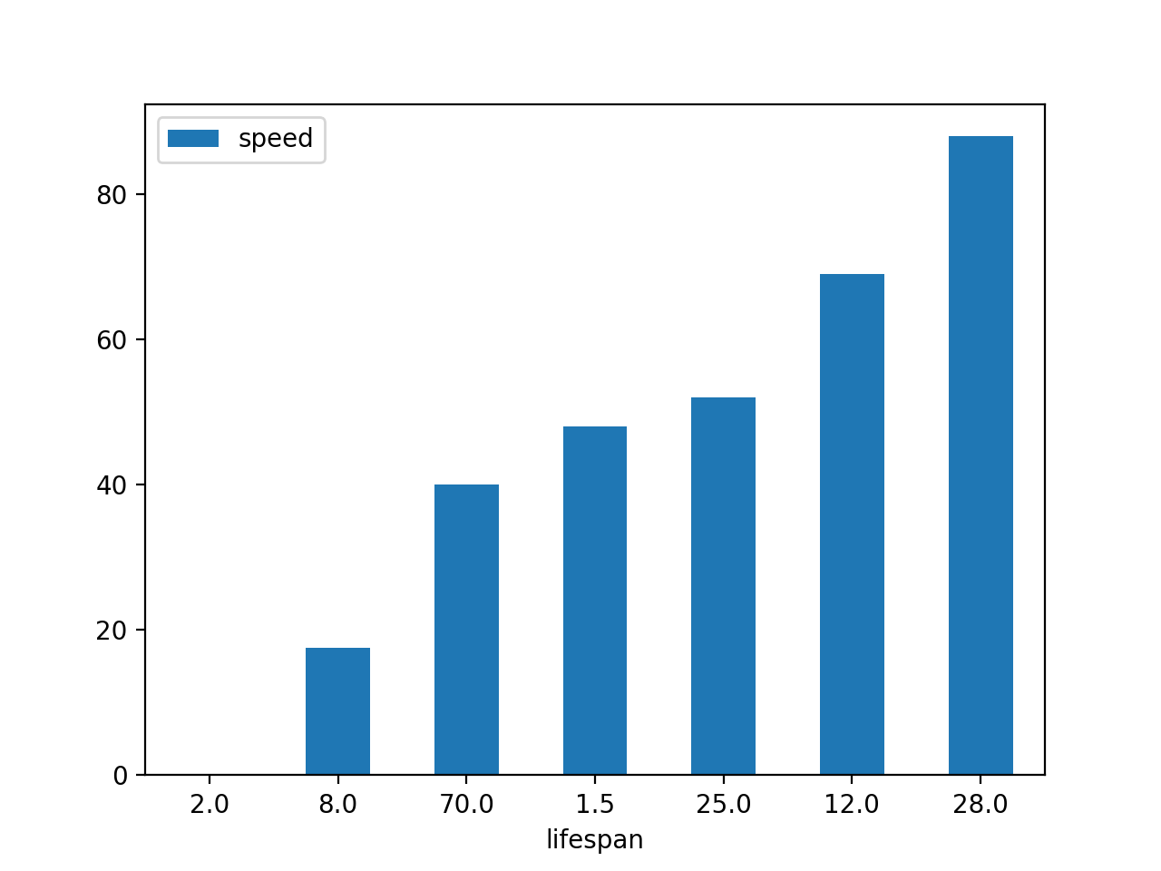
x (label or position, optional) – Allows plotting of one column versus another. If not specified, the index of the DataFrame is used.
y (label or position, optional) – Allows plotting of one column versus another. If not specified, all numerical columns are used.
color (str, array-like, or dict, optional) –
The color for each of the DataFrame’s columns. Possible values are:
- A single color string referred to by name, RGB or RGBA code,
for instance ‘red’ or ‘#a98d19’.
- A sequence of color strings referred to by name, RGB or RGBA
code, which will be used for each column recursively. For instance [‘green’,’yellow’] each column’s bar will be filled in green or yellow, alternatively. If there is only a single column to be plotted, then only the first color from the color list will be used.
- A dict of the form {column namecolor}, so that each column will be
colored accordingly. For example, if your columns are called a and b, then passing {‘a’: ‘green’, ‘b’: ‘red’} will color bars for column a in green and bars for column b in red.
New in version 1.1.0.
**kwargs – Additional keyword arguments are documented in
DataFrame.plot().
- Returns
An ndarray is returned with one
matplotlib.axes.Axesper column whensubplots=True.DataFrame.plot.barh : Horizontal bar plot. DataFrame.plot : Make plots of a DataFrame. matplotlib.pyplot.bar : Make a bar plot with matplotlib.
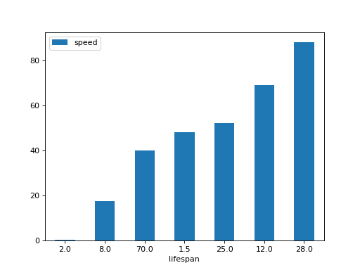
Basic plot.
(Source code, png, hires.png, pdf)

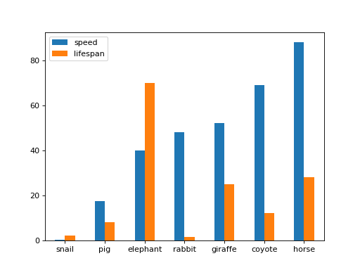
Plot a whole dataframe to a bar plot. Each column is assigned a distinct color, and each row is nested in a group along the horizontal axis.
(Source code, png, hires.png, pdf)
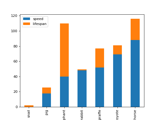
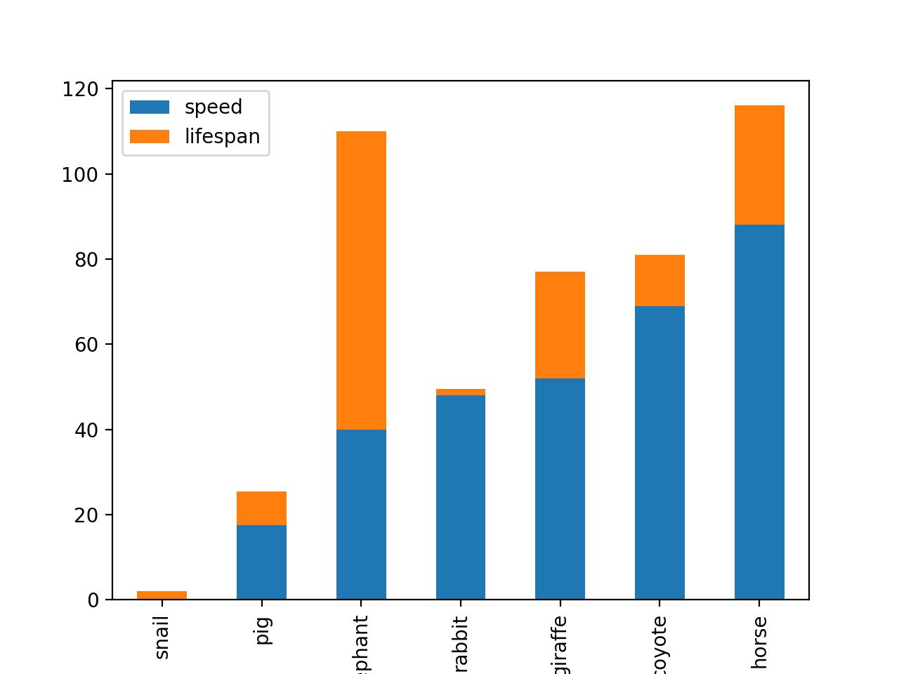
Plot stacked bar charts for the DataFrame
(Source code, png, hires.png, pdf)
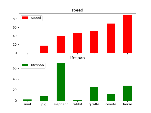
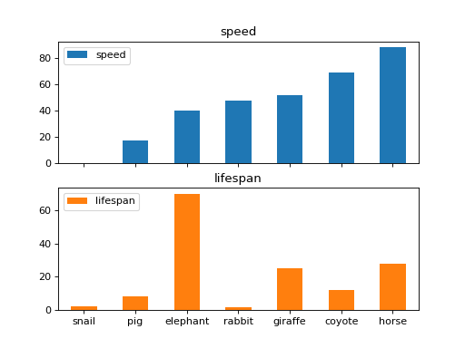
Instead of nesting, the figure can be split by column with
subplots=True. In this case, anumpy.ndarrayofmatplotlib.axes.Axesare returned.(Source code, png, hires.png, pdf)

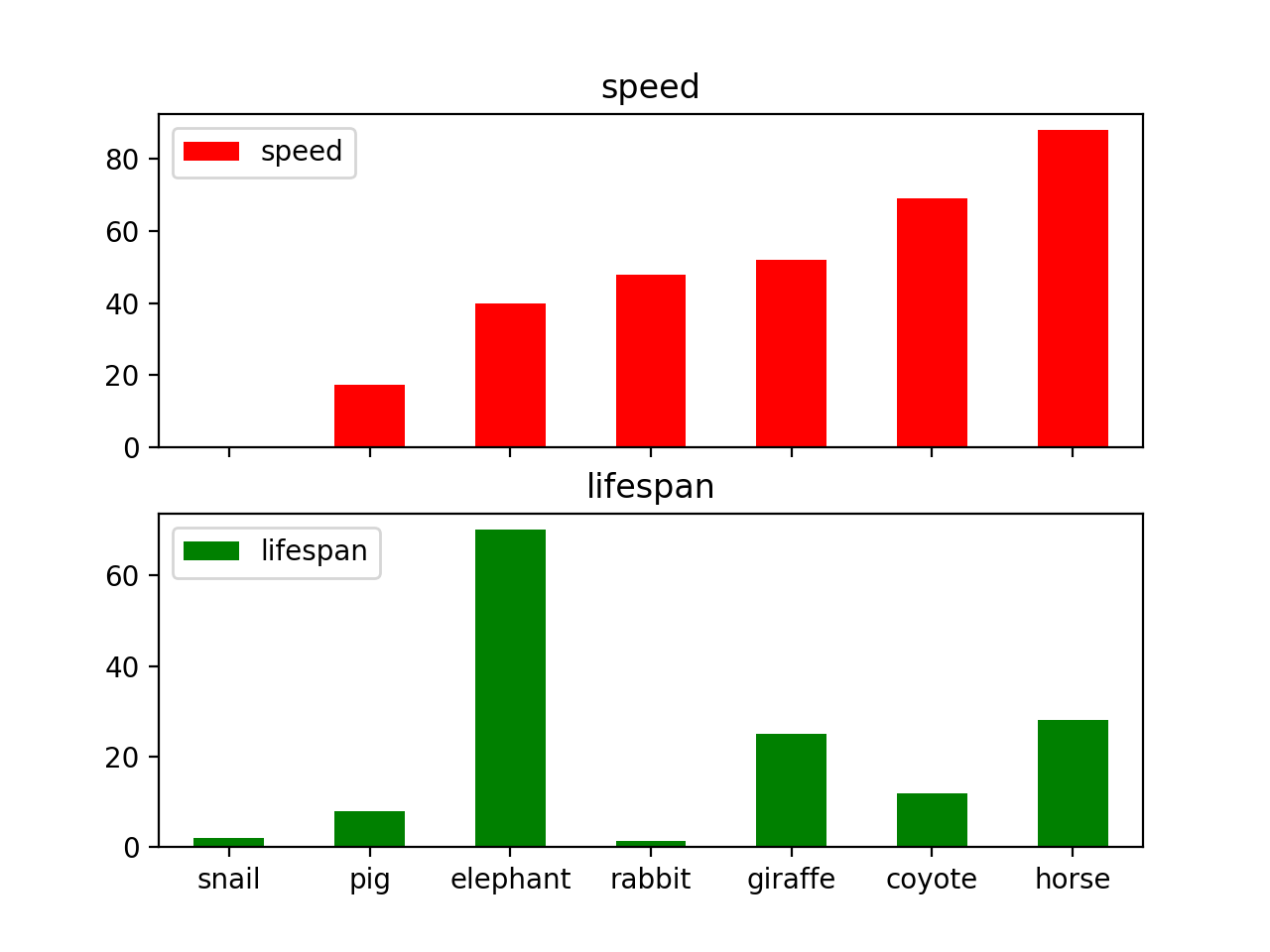
If you don’t like the default colours, you can specify how you’d like each column to be colored.
(Source code, png, hires.png, pdf)
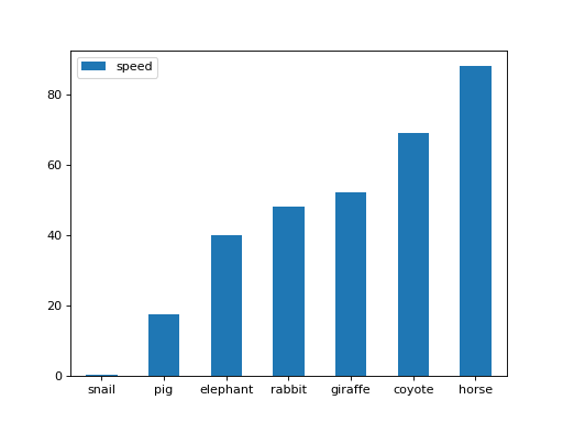
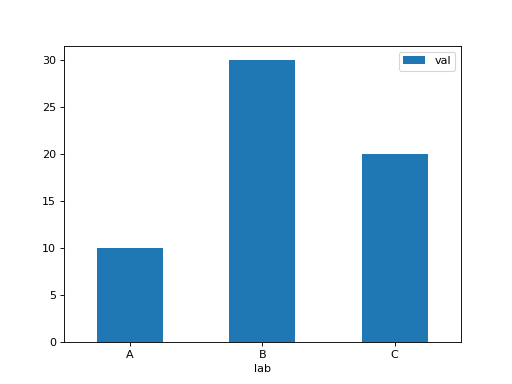
Plot a single column.
(Source code, png, hires.png, pdf)
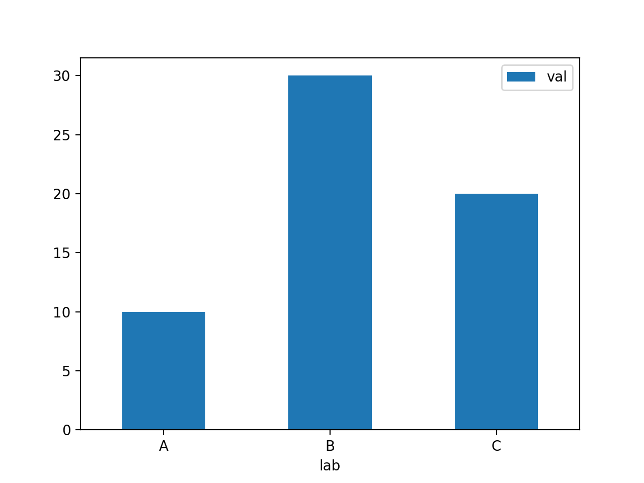
Plot only selected categories for the DataFrame.
(Source code, png, hires.png, pdf)
- Return type
matplotlib.axes.Axes or np.ndarray of them